Monday 20 October 2014

research and planning: audience feedback on drafts

I put examples of what I could put for the cover line and put the title to get an idea how it will look. Made it very conventional to other magazine in general.
I tried putting some colour themes in this content draft and it does look conventional again to a rock magazine because of the chose of colours.
I haven't completely thought of how the double page spread will look and couldn't put a title name yet however I've put the title, image, gutters briefly on the page where I think I will put them.

Aisha said: to put a drawn version of the chosen masthead on the cover so you can see what it looks like. And put some cover lines on the cover so that it looks what you are actually going to put on it  and see will it fit around the image compared to your other draft.


Megan said: have a better layout for your double page spread like where your putting your gutter.

research and planning: test shots

This shot is a medium long shot of the test shot model, I will be taking actual pictures for the magazine here. This picture has been taken without a flask.
This another medium long shot without the flash in the same place but with no buildings behind me. There was a bit of sun so that is why this picture is more lighter.
This is a medium shot inside the building, the pictures been taken without flash but there is a yellowy, orange tint. Inside the building isn't a great place to take photo shot.

Friday 17 October 2014

research and planning:costume and props research

The costumes used in this picture are basic; they are wearing black pant, blazer and leather jacket.
These basics black clothing are convectional to the magazine I am going to do.

The costumes hear are old fashioned but they are wearing blazers similar to the top photo and they are the same colour.

Here they are are wearing shirts which are plain and the person in the front is wearing more colour to highlight the fact he is the frontman.

research and planning: production schedule

research and planning:equipment and software list

I will need a mac to access most of the softwares I plan to use.


Camera to take photos of the model, setting etc.


Photoshop to do the cover and double page spread. Indesign to the content page. I will be using these two software so that it looks professional.

research and planning: costume and props


The costume will be clean looking because most of the questionnaire answer prefer clean layout so this means clean costume will be expected by the audience. The colour theme will be black and white maybe a bit of colour depending on how it will look. I will take test shorts. Most rock stars have short hair so my model will be someone with short hair however nothing crazy like the hair colour. The model will have natural coloured hair.

1. The model will be wearing a (rock) t-shirts with a leather jacket to make the model look like rock.

2. Jeans will be skinny/ a bit baggy, the colour will be black.

3. Hair will be neatly done and short.


All of these are conventional to what rock artist wear to a photo shoot or interview.


research and planning: results of questionnaire


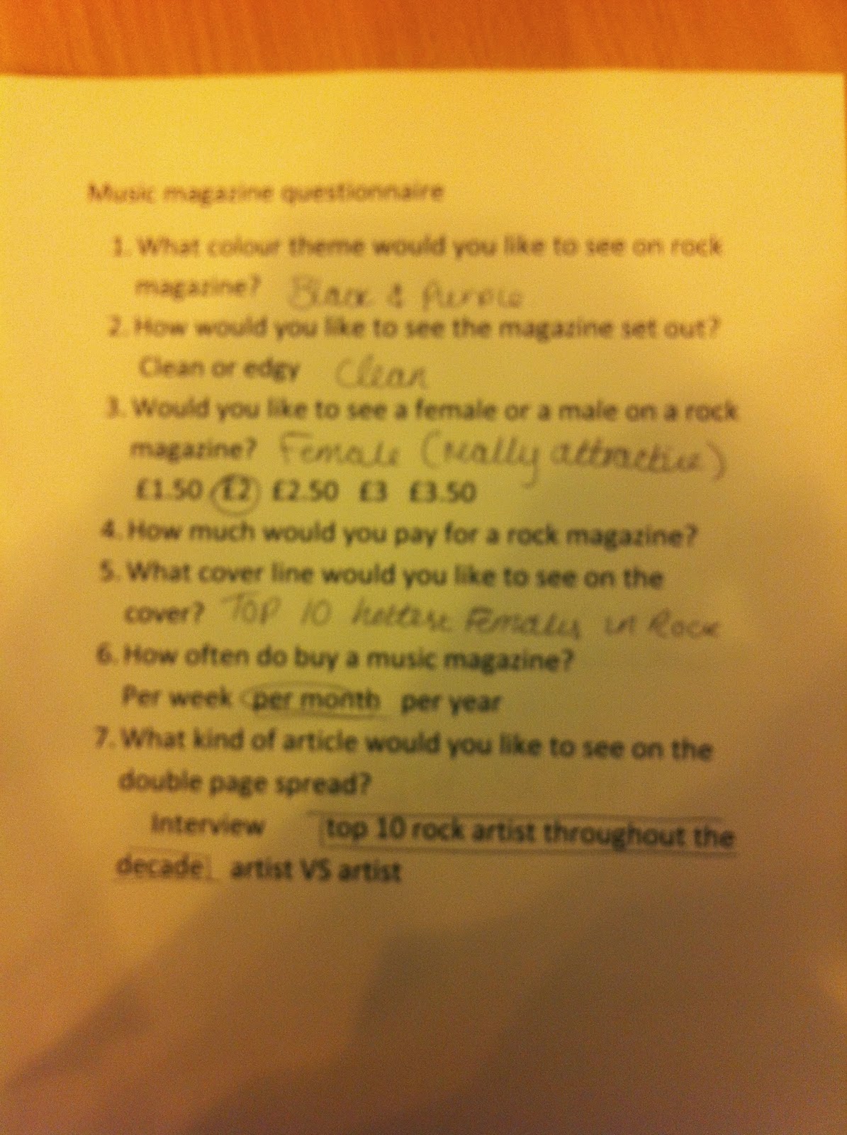
The results of what colour should be the used in the magazine is red, black and white however I will also use grey if needed.

The target audience want clean layout not edgy because it's classic rock not hard rock.

The front cover will be male because it is conventional for a rock magazine and this result proves it.

The target audience want the magazine to cost £2 so that they can afford it.

I will be using most of the suggestion because it was an open question but mostly about interviews and popular music in the charts.

Per month seems reasonable because most magazine only have different magazine every month.

Interview will be on the double page spread so this mean I can make plans in the future of what I can include.

research and planning: audience interview video


Question

1. In a tock magazine what stands out to you?
2. In a rock magazine would you prefer a male or a female?
3. What colour theme would you like to see on a rock magazine?
4. What cover line would you like to see on a rock magazine cover?

Analysis

The main thing that stands out to the audience is the image because it is the first thing they look at and if they find it amusing they would what to read the magazine.
They prefer a male because that is what they see in a rock magazine cover and it will be specifically aimed at the male audience like it says on the target audience powerpoint post.
The colour theme they would like to see on the magazine is mainly black, red, white and grey because it suits the genre.
The cover line they will like to see is who I am interviewing in the rock (which artist).